Black Swan
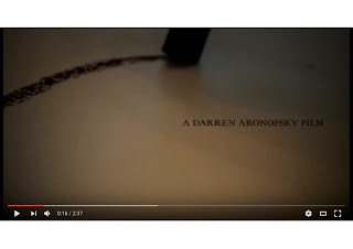
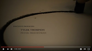
Fonts are a key element to revealing aspects of a film within the first few seconds of the opening sequence or even the poster or trailer of a film, the font of which can dramatically impact the way an audience perceives the title sequence. For example the typeoraphy in the Black Swan title sequence is very elegant which directly corresponds with the Ballerinas however the font also has a gothic side, this could hinting at the dark ending Natalie Portman's character will eventually fall to, this font mimics the plot of the film. The font also constantly stay inside the circles drawn with the bylack chalk held by the ambiguous character, this could be hinting to the dark circle that Nina Sayers becomes stuck in, the font is a representative of her.
Black Swan opening sequence
The bold letters stand out in contrast to the simple images that are presented on screen, it could be seen as a decorative font as it stands out, the constant capital letters add this as they make the text seem more important as it is not in lower case. In terms of pitch the space allowed is quite large, this adds to the bold effect that the typeface is creating. The text is always inside the line that has been drawn and near it, this draws your eyes further to the text as naturally your eyes would be following the line that has been drawn. The text could be considered heavy which may imply of the emotion that will be felt by the main character, it contrasts the usual delicate and elegant font that would be associated with a ballerina, therefore it suggests a negative tone to the film.
 The overall mood of the film created by the font is dark, almost mysterious tone, the font juxtaposes with the sound being played in the background at the start however as the title sequence goes on the music becomes heavier. This reflects the film as time goes on Nina Sayers, the main characters, becomes in a worse never-ending emotional wreckage. The typeface reflects her and the black line becomes what she is experiencing at the time, the line is becoming quicker and quicker which reflects her mental state, she is experiencing a whirlwind of mental healthy problems accompanied by the stress of being the star of the show.
The font is very effective in terms of it reflecting the character and story line, it draws the audience's attention and stands out in the title sequence, it does not become ambiguous at any point and is very effective in reflecting her emotional state, in my option how it juxtaposes the normal view of a ballerina is what makes it so effective as it is not what is expected


